Should you use pen or pencil for journaling? What’s best to use in your notebook? Whether you want to use your blank pages for writing or drawing, it’s nice to know how your pens and pencils will work with the paper. Let’s take a look, shall we?
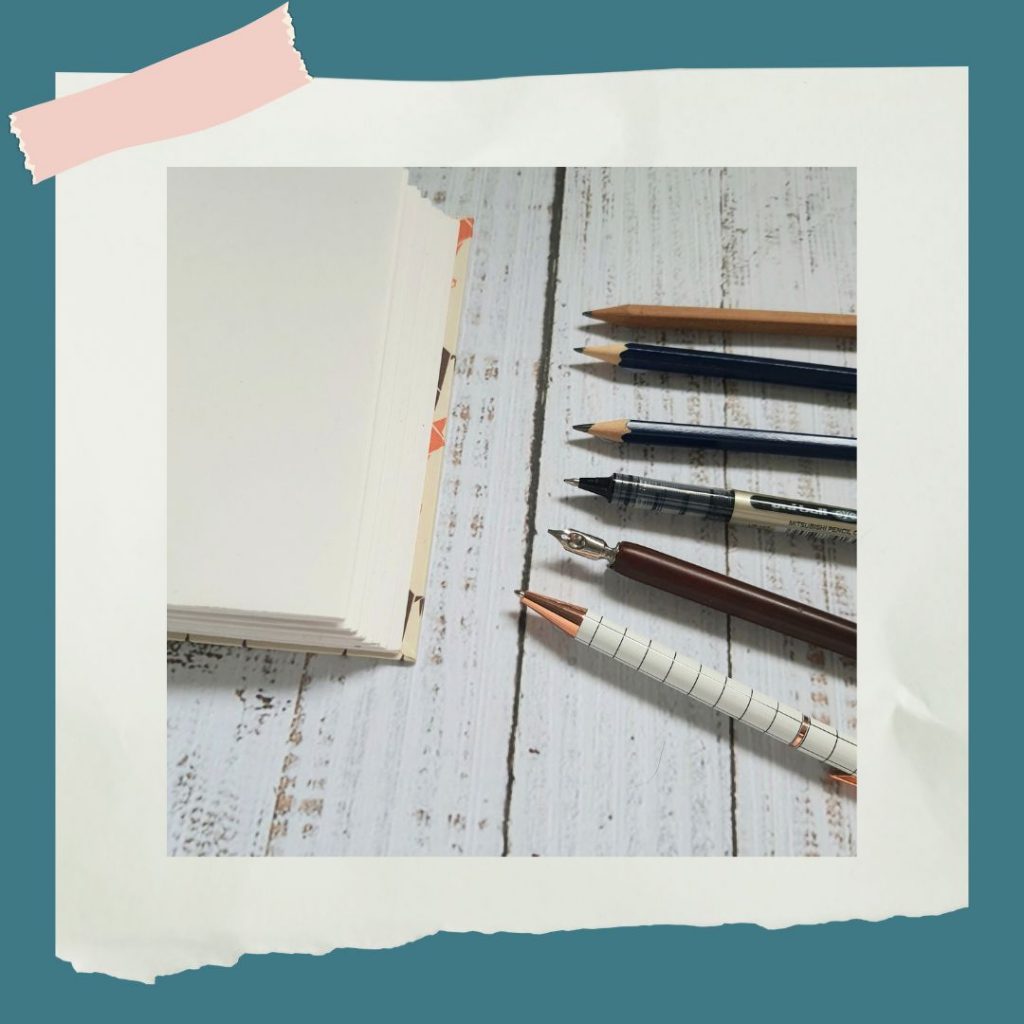
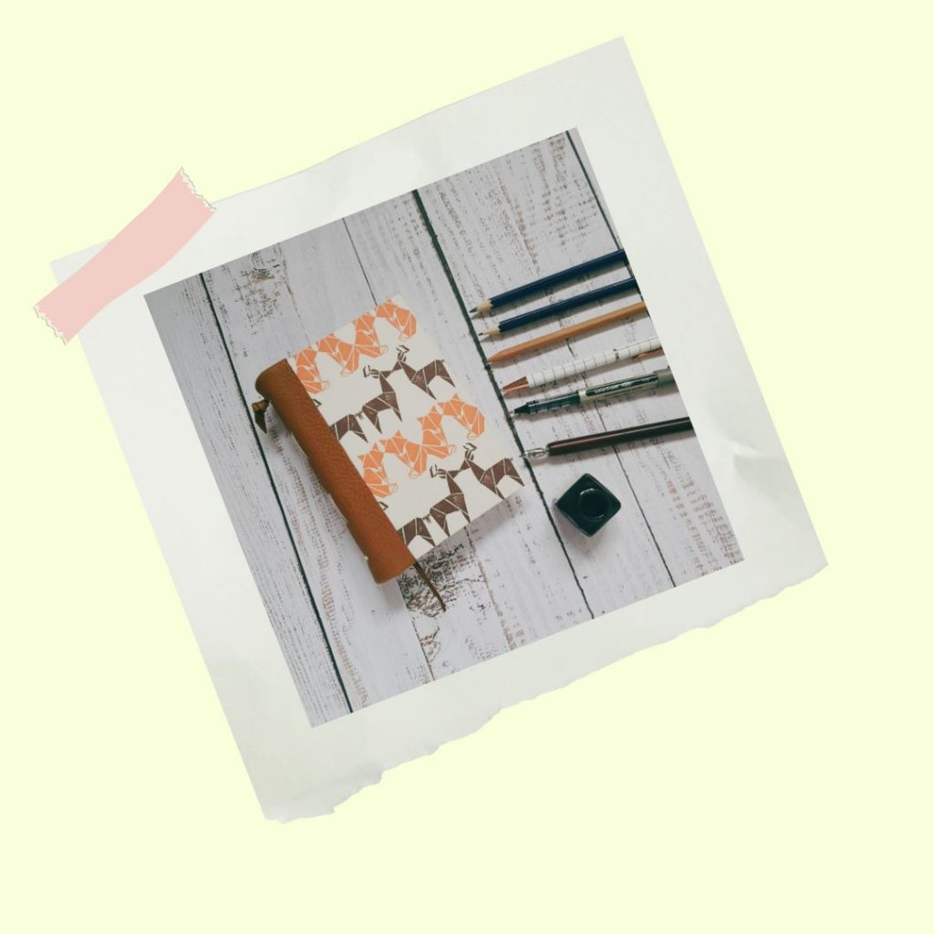
The paper used in my journals is 140gsm cartridge paper (it’s been made using upcycled takeaway cups!). This paper is quite sturdy and will take different mediums; pens and pencils, and also some paints (more on that another time). Here, I’ll be looking at some of the different pencils and pens you might be using for writing or drawing in your journal – you’ll be able to see what each of them look like on paper.
Ever wondered what the letters and numbers on pencils mean? Generally, HB is your bog-standard pencil: H = hard, B = blackness. You can get various grades of H & B pencils. With H pencils, the higher the number the harder the pencil, creating a harder, lighter line. When it comes to B, the higher the number the softer the pencil, creating a softer, darker line.
While you normally associate pens with writing, you can use them for drawing too. There are loads of different types of pens; I’ve chosen 3 I think fit best with using in journals.
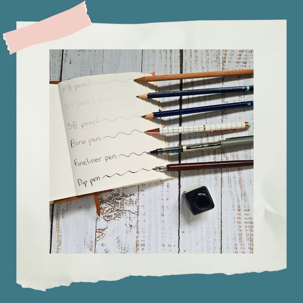
| So, what difference does this all make when it comes to drawing and writing? Here are some simple doodles to give you an idea: |
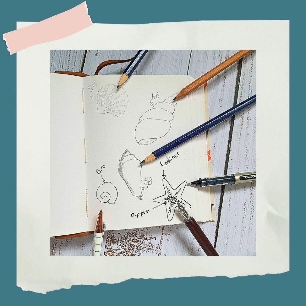
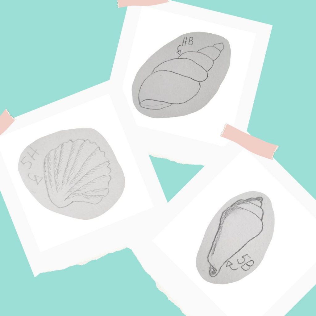
Use H to create hard, clean lines. The fact that they produce lighter, more precise lines makes them good for writing and technical drawings.
B pencils can be used for sketching and adding texture. Because they’re soft, they can be more expressive; it also makes them easier to rub out!
Biros (or ballpoint pens) are best for writing – great for everyday journaling. But you can doodle with them too!
Fineliners are perfect for journaling; you can use them for writing, drawing or doing your layouts.
Dip pens are just that – pens that you dip… into a pot of ink! They’re often used for calligraphy, but you can use them for sketches, too. Using the different angles of the nib means you can create various line widths and strengths. They can take a while to get used to, but are very satisfying to use once you’ve got the hang of it.

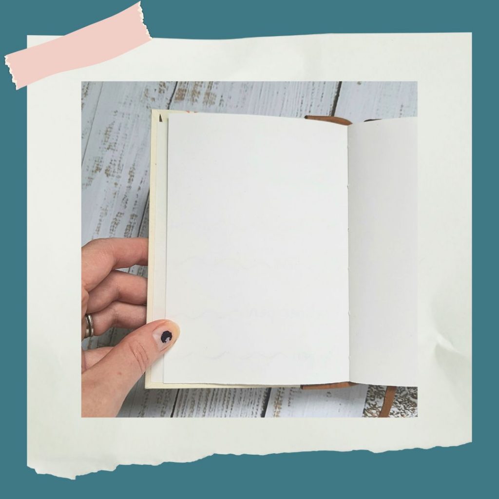
What else would you want to know about the paper quality of a journal or notebook? How about how much it shows through to the other side? As you can see, with the paper I use in my handmade journals, you can hardly see the pencil, while the dip pen and fineliner show through the most.
Head to my Etsy shop for handmade blank
journals and notebooks.